@stlvs
Please stop spamming this topic. The last post is to much. You quote another post and place your image 2 times. Why? This is a behave like a child.
I saw your wish at the first post and test some things. But i don't find the perfekt result for this.
Bring me a complete conzept for this and i can test it. what should go in the free space of the jog?
I understand the longer songpowave. But there also must be place the Timer, current BPM, Slip mode, Vinyl mode... Bring me a complete grafic.
_________________________________________________________________________________________________
@DjTasosMavrokefalos
I saw also your post.
Many changes in the code and destroi my XML code logic.
In your idea there is no place for the Browser. Also the mixer where split.
Posted Sat 15 Apr 23 @ 3:22 pm
DennYo Beats wrote :
@stlvs
Please stop spamming this topic. The last post is to much. You quote another post and place your image 2 times. Why? This is a behave like a child.
I saw your wish at the first post and test some things. But i don't find the perfekt result for this.
Bring me a complete conzept for this and i can test it. what should go in the free space of the jog?
I understand the longer songpowave. But there also must be place the Timer, current BPM, Slip mode, Vinyl mode... Bring me a complete grafic.
_________________________________________________________________________________________________
@DjTasosMavrokefalos
I saw also your post.
Many changes in the code and destroi my XML code logic.
In your idea there is no place for the Browser. Also the mixer where split.
Please stop spamming this topic. The last post is to much. You quote another post and place your image 2 times. Why? This is a behave like a child.
I saw your wish at the first post and test some things. But i don't find the perfekt result for this.
Bring me a complete conzept for this and i can test it. what should go in the free space of the jog?
I understand the longer songpowave. But there also must be place the Timer, current BPM, Slip mode, Vinyl mode... Bring me a complete grafic.
_________________________________________________________________________________________________
@DjTasosMavrokefalos
I saw also your post.
Many changes in the code and destroi my XML code logic.
In your idea there is no place for the Browser. Also the mixer where split.
1st I was trying to get your attention so I can get an answer, it is not my intention to spam anything and 2nd I am not welle undesrstand how is thiw working to post a message here with a photo, that's why I upload so many photos by mistake..
Anyway forgive me for all these and forget what I am asking, it's not a big deal.. Take care..
Posted Sat 15 Apr 23 @ 6:29 pm
1st every post here have my attention.
But its very timefull to add so big changes in the skin. I don't create money with this. Create Skins is a hobby from me for the community.
For example. add your wish i think 6-10 houres
Create this Skin/Interface (Project Control) to the actual point: over 3 times of all seasons Big Bang Theorie. ( 800-1000 houres)
I have a concept. look here:

Post images is simple. After upload here you have in the textbox a forumcode syntax IMAGE1 ... this syntax show the picture in your post. When you use IMAGE1 more than on time in a post the picture will duplicate.
But its very timefull to add so big changes in the skin. I don't create money with this. Create Skins is a hobby from me for the community.
For example. add your wish i think 6-10 houres
Create this Skin/Interface (Project Control) to the actual point: over 3 times of all seasons Big Bang Theorie. ( 800-1000 houres)
I have a concept. look here:

Post images is simple. After upload here you have in the textbox a forumcode syntax IMAGE1 ... this syntax show the picture in your post. When you use IMAGE1 more than on time in a post the picture will duplicate.
Posted Sat 15 Apr 23 @ 6:45 pm
DennYo Beats wrote :
1st every post here have my attention.
But its very timefull to add so big changes in the skin. I don't create money with this. Create Skins is a hobby from me for the community.
For example. add your wish i think 6-10 houres
Create this Skin/Interface (Project Control) to the actual point: over 3 times of all seasons Big Bang Theorie. ( 800-1000 houres)
I have a concept. look here:

Post images is simple. After upload here you have in the textbox a forumcode syntax IMAGE1 ... this syntax show the picture in your post. When you use IMAGE1 more than on time in a post the picture will duplicate.
But its very timefull to add so big changes in the skin. I don't create money with this. Create Skins is a hobby from me for the community.
For example. add your wish i think 6-10 houres
Create this Skin/Interface (Project Control) to the actual point: over 3 times of all seasons Big Bang Theorie. ( 800-1000 houres)
I have a concept. look here:

Post images is simple. After upload here you have in the textbox a forumcode syntax IMAGE1 ... this syntax show the picture in your post. When you use IMAGE1 more than on time in a post the picture will duplicate.
My point for all of this is 1) longer songposwave=better detail of how the song goes or what elements it has and 2) I believe that the Jog kind of look is getting old..so I could keep the down frame with bpm, vl, sl and time details and the upper frame with all the other details (gain, key etc) ideally I would put them above the songposwave where are the title and "master" area, so the songposwave get even more larger..
I am not an expert, maybe I propose something impossible, but let me tell you that I apreciate all the work that you have done so far with all my heart, I am just sharing my ideas for something (I believe) better, that's all
Posted Sat 15 Apr 23 @ 7:11 pm
This is my the current idea. you can turn off the extended Song Infos.

1) longer songposwave=better detail of how the song goes or what elements it has
as a dj you should know songs that you play, such words comes from DJs they use online content that they never heare before, the jog contains the most important informations

1) longer songposwave=better detail of how the song goes or what elements it has
as a dj you should know songs that you play, such words comes from DJs they use online content that they never heare before, the jog contains the most important informations
Posted Sat 15 Apr 23 @ 7:21 pm
DennYo Beats wrote :
This is my the current idea. you can turn off the extended Song Infos.

1) longer songposwave=better detail of how the song goes or what elements it has
as a dj you should know songs that you play, such words comes from DJs they use online content that they never heare before, the jog contains the most important informations

1) longer songposwave=better detail of how the song goes or what elements it has
as a dj you should know songs that you play, such words comes from DJs they use online content that they never heare before, the jog contains the most important informations
This is IT!! That's what I'm talking about..You can have all the amount of information that you need without being them in a circle with a needle going round all the time :-)
That's perfect
Posted Sat 15 Apr 23 @ 7:34 pm
Version 1.0.4 - 2023-04-17
bugfix - position bug browser and Support Page on MAC
add - Songinfos can toggle to Custum Buttons (gain,bpm,com,rate)
add - classic Beatwave and split horizontal Scratchwave
add - option to hide the Jog
change - visual changes
_________________________________________________________________________________
The Option hide Jog is for the big, middle and small Variation.
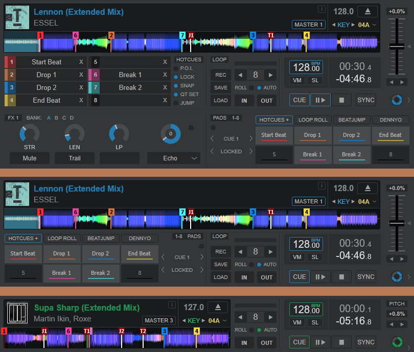
_________________________________________________________________________________
Songinfos can toggle to Custum Buttons. Customize Your Songinfos.
click on the words GAIN, BPM, COM or RATE to change to 2 custom button.
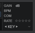
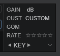
now you can click with rightclick and add your needed Informations.
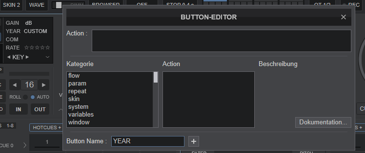
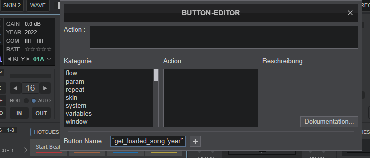
for example, Button Name:
left button YEAR
right button `get_loaded_song 'year'`
On the left 4 Custom Buttons you can not use the action. The action is coded for toggle between GAIN, BPM, COM, RATE and CUSTOM.
bugfix - position bug browser and Support Page on MAC
add - Songinfos can toggle to Custum Buttons (gain,bpm,com,rate)
add - classic Beatwave and split horizontal Scratchwave
add - option to hide the Jog
change - visual changes
_________________________________________________________________________________
The Option hide Jog is for the big, middle and small Variation.

_________________________________________________________________________________
Songinfos can toggle to Custum Buttons. Customize Your Songinfos.
click on the words GAIN, BPM, COM or RATE to change to 2 custom button.


now you can click with rightclick and add your needed Informations.


for example, Button Name:
left button YEAR
right button `get_loaded_song 'year'`
On the left 4 Custom Buttons you can not use the action. The action is coded for toggle between GAIN, BPM, COM, RATE and CUSTOM.
Posted Mon 17 Apr 23 @ 2:09 pm
Might as well add side by side scratch wave.
Posted Mon 17 Apr 23 @ 7:23 pm
DennYo Beats wrote :
@stlvs
Please stop spamming this topic. The last post is to much. You quote another post and place your image 2 times. Why? This is a behave like a child.
I saw your wish at the first post and test some things. But i don't find the perfekt result for this.
Bring me a complete conzept for this and i can test it. what should go in the free space of the jog?
I understand the longer songpowave. But there also must be place the Timer, current BPM, Slip mode, Vinyl mode... Bring me a complete grafic.
_________________________________________________________________________________________________
@DjTasosMavrokefalos
I saw also your post.
Many changes in the code and destroi my XML code logic.
In your idea there is no place for the Browser. Also the mixer where split.
Please stop spamming this topic. The last post is to much. You quote another post and place your image 2 times. Why? This is a behave like a child.
I saw your wish at the first post and test some things. But i don't find the perfekt result for this.
Bring me a complete conzept for this and i can test it. what should go in the free space of the jog?
I understand the longer songpowave. But there also must be place the Timer, current BPM, Slip mode, Vinyl mode... Bring me a complete grafic.
_________________________________________________________________________________________________
@DjTasosMavrokefalos
I saw also your post.
Many changes in the code and destroi my XML code logic.
In your idea there is no place for the Browser. Also the mixer where split.
i didn't do it my friend.....
Posted Mon 17 Apr 23 @ 8:23 pm
Djratedxxx919 wrote :
Might as well add side by side scratch wave.
Version 1.0.4
split horizontal Scratchwave is side by side Scratchwave ;)

Posted Mon 17 Apr 23 @ 8:49 pm
Mr.Black Greece wrote :
i didn't do it my friend.....
i didn't do it my friend.....
You weren't meant. The Bugfix for the Browser Position on MAC is on the way.
Posted Mon 17 Apr 23 @ 8:51 pm
Perfect add the Hide-Jog option,thank you very very much!! I spot (maybe) a bug, when you select "Bigger Font" on "Text font size" some icons from "Topzone" disappears..
Posted Tue 18 Apr 23 @ 8:14 pm
Your new update won't update, do I need to delete the original skin then install again?
Posted Tue 18 Apr 23 @ 10:20 pm
stlvs wrote :
I spot (maybe) a bug, when you select "Bigger Font" on "Text font size" some icons from "Topzone" disappears..
I can confirm. I have the same on my M1 Mac.
Posted Wed 19 Apr 23 @ 12:04 am
DennYo Beats wrote :
Version 1.0.4
split horizontal Scratchwave is side by side Scratchwave ;)

Djratedxxx919 wrote :
Might as well add side by side scratch wave.
Version 1.0.4
split horizontal Scratchwave is side by side Scratchwave ;)

Just tested it. You implemented this better in Controller 2020 with more controls.
Posted Wed 19 Apr 23 @ 4:10 am
Version 1.0.5 - 2023-04-19
bugfix - The Buttons on the Topzone won't show at Text Size bigger
add - Master / Select Deck Buttons as Wave Overlay
bugfix - The Buttons on the Topzone won't show at Text Size bigger
add - Master / Select Deck Buttons as Wave Overlay
Posted Wed 19 Apr 23 @ 7:01 am
MrDjLinton wrote :
Your new update won't update, do I need to delete the original skin then install again?
Sorry, Ignore this all fine now
Posted Wed 19 Apr 23 @ 7:37 am
DennYo Beats wrote :
Version 1.0.4 - 2023-04-17.
This is know my default skin. Looks and works so nice.. Man this is really some work to admire.
Also, Thank you for fixing it for MAC
Posted Wed 19 Apr 23 @ 5:44 pm
DennYo Beats wrote :
You weren't meant. The Bugfix for the Browser Position on MAC is on the way.
Mr.Black Greece wrote :
i didn't do it my friend.....
i didn't do it my friend.....
You weren't meant. The Bugfix for the Browser Position on MAC is on the way.
i get the update!!!
amazing!!!!!
thanks mate!!!!
Posted Wed 19 Apr 23 @ 8:00 pm
A kindly suggestion for a future update maybe you could skip the word "bpm" from the "current bpm" frame so that the decimal digits are more distinct as well, and 2nd switching places the "bpm, VM, SL" frame with the "Timer" one might be better because you can have the standard bpm and the current one aligned one under other

Posted Sun 23 Apr 23 @ 4:15 pm


