First, I want to say that I love this skin. So much flexibility, but combined with LOTS of visual/color indicators of deck status.
My question, and maybe I'm missing something simple: Is there a way to save your preferred configuration as a default so that it opens with those skin/wave settings when opening VDJ?
Thanks!
My question, and maybe I'm missing something simple: Is there a way to save your preferred configuration as a default so that it opens with those skin/wave settings when opening VDJ?
Thanks!
Posted Fri 03 Jul 20 @ 11:30 pm
que colega una pregunta porque ya no sale el color en los hotcues
Posted Sun 05 Jul 20 @ 6:14 am
Version History 3.1.3 - 2020/07/07
-Bugfix - the jog color on the left deck (blue/yellow) wasn't invisible
-Bugfix - little changes
-add - the stems feature menu can activate by rightclick on the words "HI" MID" "LOW"
-add - you can change the color intensity of the deck border (master deck, select deck)("Skin Button"/Deck Setup/Border Color)
-add - you can hide of the P.O.I., LOCK, SNAP, REC, SAVE, LOAD buttons ("Skin Button"/Deck Setup/Hide Buttons)
-add - you can hide of the controlls on the Center layout SCRATCH and show only the waves ("Skin Button"/Center/Hide Controlls on Scratch)
Posted Tue 07 Jul 20 @ 12:07 pm
Hi,
thank you so much for your skin. You made my dreams real. Ive analyzed your .XML and learned how to modify it. So this is the result: 115 custom button bar :c)
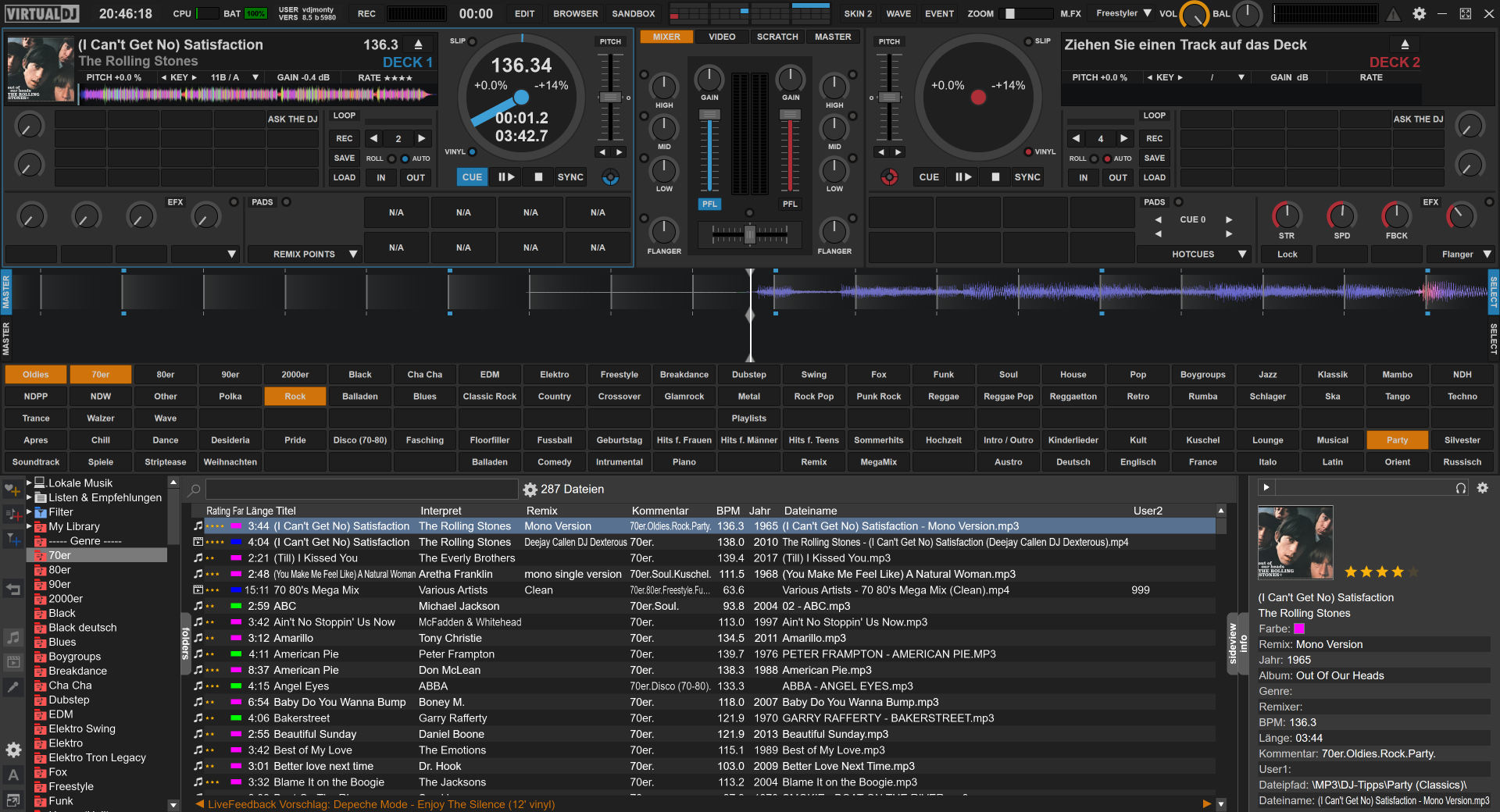
I can add a genre to the song by just clicking to the custom button (im just adding the genre text to the ID tag "comments"). I can also make automatic playlists depend on the genre, the only thing, what im missing, is: I cannot remove any genre from the comments field anymore. It seems, there is no param_remove or param_replace function in VDJ.
thank you so much for your skin. You made my dreams real. Ive analyzed your .XML and learned how to modify it. So this is the result: 115 custom button bar :c)

I can add a genre to the song by just clicking to the custom button (im just adding the genre text to the ID tag "comments"). I can also make automatic playlists depend on the genre, the only thing, what im missing, is: I cannot remove any genre from the comments field anymore. It seems, there is no param_remove or param_replace function in VDJ.
Posted Tue 07 Jul 20 @ 6:53 pm
Great Update
Posted Thu 09 Jul 20 @ 2:15 am
Version History 3.1.4 - 2020/07/09
-add - black color sheme
-add - you can change the text color Artist/Title by click on it
-add - black color sheme
-add - you can change the text color Artist/Title by click on it
Posted Thu 09 Jul 20 @ 1:51 pm
Version History 3.1.5 - 2020/07/09
-bugfix - add color change Artist/Title to the extra big layout
-bugfix - add color change Artist/Title to the extra big layout
Posted Thu 09 Jul 20 @ 2:56 pm
Is there any way for a more transparent needle on the jog wheel white mode?
Posted Thu 16 Jul 20 @ 11:26 am
color is dark and text is black, transparency won't help but a lighter needle can
i.e. modify color
<define color="jogwhitespinner" value="#121315"/>
to (as an example, use any other color you prefer)
<define color="jogwhitespinner" value="#727375"/>
for every instances (lines 535, 1139, 1753)
i.e. modify color
<define color="jogwhitespinner" value="#121315"/>
to (as an example, use any other color you prefer)
<define color="jogwhitespinner" value="#727375"/>
for every instances (lines 535, 1139, 1753)
Posted Thu 16 Jul 20 @ 12:21 pm
Nicotux wrote :
color is dark and text is black, transparency won't help but a lighter needle can
i.e. modify color
<define color="jogwhitespinner" value="#121315"/>
to (as an example, use any other color you prefer)
<define color="jogwhitespinner" value="#727375"/>
for every instances (lines 535, 1139, 1753)
i.e. modify color
<define color="jogwhitespinner" value="#121315"/>
to (as an example, use any other color you prefer)
<define color="jogwhitespinner" value="#727375"/>
for every instances (lines 535, 1139, 1753)
Many many thanks!!
Posted Thu 16 Jul 20 @ 1:22 pm
Nicotux wrote :
color is dark and text is black, transparency won't help but a lighter needle can
i.e. modify color
<define color="jogwhitespinner" value="#121315"/>
to (as an example, use any other color you prefer)
<define color="jogwhitespinner" value="#727375"/>
for every instances (lines 535, 1139, 1753)
i.e. modify color
<define color="jogwhitespinner" value="#121315"/>
to (as an example, use any other color you prefer)
<define color="jogwhitespinner" value="#727375"/>
for every instances (lines 535, 1139, 1753)
Actually if I could make them as they are in jogdarkspinner option,(Deck 1:Blue,Deck 2:Red,Deck 3:Green,Deck 4:Yellow) it would be great...any help?
Posted Thu 16 Jul 20 @ 1:44 pm
Look for the lines where jogdarkspinner colors are defined, note the values, then replace the jogwhitespinner values with the ones you noted.
Alternatively, where the jogwheel code calls the color definition, change it from calling jogwhitespinner to jogdarkspinner.
Alternatively, where the jogwheel code calls the color definition, change it from calling jogwhitespinner to jogdarkspinner.
Posted Thu 16 Jul 20 @ 1:58 pm
groovindj wrote :
Look for the lines where jogdarkspinner colors are defined, note the values, then replace the jogwhitespinner values with the ones you noted.
Alternatively, where the jogwheel code calls the color definition, change it from calling jogwhitespinner to jogdarkspinner.
Alternatively, where the jogwheel code calls the color definition, change it from calling jogwhitespinner to jogdarkspinner.
I finally made it..Thank you very much!!
Posted Thu 16 Jul 20 @ 3:10 pm
@Denny DennYo ,
Firstly, thank you so much for your skin.
It's very, very good & I like many, many aspects of your creation.
I am a hobbyist but your skin is a serious encouragement for me, to get into VDJ 2020/2021 even more
( recently, I resolved a long-running MIDI issue, which prevented me using VDJ 2020 / 2021, but last 1+ month,
I've been getting more involved with VDJ, in lockdown ... and it's been good )
Secondly, I'm trying to tweak and add/remove some parts of your skin to suit my need,
but I made some mistakes with the .XML file, so I reverted the changes back.
I want to know how to make the following changes??
(and also it's somewhat my request to you, to consider in the skin updates .. ha! :-P )
I just created some mock-examples, to show my request.
_____________________________________________
◘ Hot Cues
How to do the following?

Time towards the Cue point (on top)
Time after the Cue point (at bottom)
PS:
How to make a Default "Lock" for HotCues ?
I've accidentally deleted Cue-Points,
because HotCues are not 'write protected / locked' by default.
1 x accidental click on a HotCue, and the whole Cue point is deleted. There is no warning.
_____________________________________________
◘ Jog Dial
I wanted to separate "Elapsed Time" and "Remain Time".
They are too close for me & it's a bit difficult to see,
because there's also a lot of text on the Jog-dial.
My experimental idea is to simplify it to just the essential information, but separate it.
Here is my example:
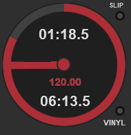
How to do this?
I tried in the .XML file, but I messed this up.
I just want elapsed time and remaining time to be 'far' from each other.
Maybe, even a slightly different colour too.
The BPM information can be to the side, or another colour.
I just made the BPM, the Deck colour, as an example.
_____________________________________________
◘ Crossfader
This is from another skin.


I like this idea of 'colour' inside the crossfader,
and moving the crossfader, moves the colour to show the dominant Deck playing
Any chance of this, in your skin? :-)
_____________________________________________
◘ Tempo / Pitch Lock and Key Lock
Current skin has the word "Pitch".
Everyone knows this is the Pitch, so this word/space can be used for other information.
Also, I'm looking for easy visual indication of TEMPO LOCK and KEY LOCK too.
So, I request something like this, on the skin:
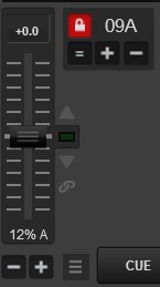
Pressing the 'lock picture', locks the tempo for both decks.
Also, there's KEY lock information too.
_____________________________________________
◘ Deck 1, Deck 2 - Song Information
I like your skin the most, as the song waveform is so big & I really need this.
Currently, it's like this:

However, for the song information, I want to modify the skin like the following:

I don't mind NOT having the cover showing, but it's good to see the cover too.
If cover is too big, then maybe make the cover smaller because it's more necessary to show other information about the songs played.
In any case, this bottom row can small font size, and have different options to show, e.g. "Master Tempo" lock, etc.
.jpg)
_____________________________________________
◘ Deck 1, Deck 2 - Mirror Image
Is it possible to consider creating a "mirror image" of the song information per deck?
For Example:
the BPM & Key information for Deck 1 is on the right (closest to the EQ / Faders)
so, the BPM & Key for Deck 2, can be on the left (closest to the EQ / Faders )
 .
. 
_____________________________________________
◘ Preview Play - Location Change ?
Is it possible to move/relocate the Preview Play button?
How about like this? (also, there's all this space (shown in green-colour, that can show some other information or have menus here. Is that possible? )

Firstly, thank you so much for your skin.
It's very, very good & I like many, many aspects of your creation.
I am a hobbyist but your skin is a serious encouragement for me, to get into VDJ 2020/2021 even more
( recently, I resolved a long-running MIDI issue, which prevented me using VDJ 2020 / 2021, but last 1+ month,
I've been getting more involved with VDJ, in lockdown ... and it's been good )
Secondly, I'm trying to tweak and add/remove some parts of your skin to suit my need,
but I made some mistakes with the .XML file, so I reverted the changes back.
I want to know how to make the following changes??
(and also it's somewhat my request to you, to consider in the skin updates .. ha! :-P )
I just created some mock-examples, to show my request.
_____________________________________________
◘ Hot Cues
How to do the following?

Time towards the Cue point (on top)
Time after the Cue point (at bottom)
PS:
How to make a Default "Lock" for HotCues ?
I've accidentally deleted Cue-Points,
because HotCues are not 'write protected / locked' by default.
1 x accidental click on a HotCue, and the whole Cue point is deleted. There is no warning.
_____________________________________________
◘ Jog Dial
I wanted to separate "Elapsed Time" and "Remain Time".
They are too close for me & it's a bit difficult to see,
because there's also a lot of text on the Jog-dial.
My experimental idea is to simplify it to just the essential information, but separate it.
Here is my example:

How to do this?
I tried in the .XML file, but I messed this up.
I just want elapsed time and remaining time to be 'far' from each other.
Maybe, even a slightly different colour too.
The BPM information can be to the side, or another colour.
I just made the BPM, the Deck colour, as an example.
_____________________________________________
◘ Crossfader
This is from another skin.


I like this idea of 'colour' inside the crossfader,
and moving the crossfader, moves the colour to show the dominant Deck playing
Any chance of this, in your skin? :-)
_____________________________________________
◘ Tempo / Pitch Lock and Key Lock
Current skin has the word "Pitch".
Everyone knows this is the Pitch, so this word/space can be used for other information.
Also, I'm looking for easy visual indication of TEMPO LOCK and KEY LOCK too.
So, I request something like this, on the skin:

Pressing the 'lock picture', locks the tempo for both decks.
Also, there's KEY lock information too.
_____________________________________________
◘ Deck 1, Deck 2 - Song Information
I like your skin the most, as the song waveform is so big & I really need this.
Currently, it's like this:

However, for the song information, I want to modify the skin like the following:

I don't mind NOT having the cover showing, but it's good to see the cover too.
If cover is too big, then maybe make the cover smaller because it's more necessary to show other information about the songs played.
In any case, this bottom row can small font size, and have different options to show, e.g. "Master Tempo" lock, etc.
.jpg)
_____________________________________________
◘ Deck 1, Deck 2 - Mirror Image
Is it possible to consider creating a "mirror image" of the song information per deck?
For Example:
the BPM & Key information for Deck 1 is on the right (closest to the EQ / Faders)
so, the BPM & Key for Deck 2, can be on the left (closest to the EQ / Faders )
 .
. 
_____________________________________________
◘ Preview Play - Location Change ?
Is it possible to move/relocate the Preview Play button?
How about like this? (also, there's all this space (shown in green-colour, that can show some other information or have menus here. Is that possible? )

Posted Fri 24 Jul 20 @ 10:39 am
 Hi!
Hi!Thanks a lot for your amazing skin, which I only recently discovered, but which addresses almost all problems I have with other skins. I am a performance DJ and do 4 deck stage mixing, and your skin is a godsent...!
Stage mixing with all decks constantly spinning and rotating through (+samplers) is quite stressful at times and requires me to get all essential information at one glance if possible, and your layout combined with the big wave forms is of immense help with that (and beats any other skin I have tested in this respect): Active deck, master, pad and loops selected etc. are where you look for it naturally, colours are clearly separated, etc. (and as we performers usually just draw from mini playlists, much browser space is not needed).
Still, some questions:
1. Where can I donate to your work? I feel you save me so much hassle, this demands a donation.
2. Under the aspect of quick information gathering there is one thingy that I find better solved in the original VDJ skin, and it´s the phase and beat counter. I use the circular phase indicator (with a custom pad to switch between 16 and 32 beats phase indicator according to track) and I have yet to find a more concise way to tell me whether I have my act together: in stage mixing phases are very important, and if you employ a lot of non-electronic music you´ll always have to check on drifting sync etc., and the combination of circles and 4 beats in the center are the fastest way to digest all the info and to correct any problems.

Would it be possible for you to do something like that?
It is possible that maybe I am too stupid to find an already present setting for it in your skin, in this case I beg your pardon and would be delighted if you could point me the right way...
3. Finally, I have another idea to even more accelerate info transmission, but I will write this up in a separate topic so as not to confuse things.
Thanks again, and keep up the great work!
Rattler
Posted Fri 24 Jul 20 @ 5:39 pm
OK, found out this one out all by myself... 👍😇😎
Rattler
Rattler
AltRattler wrote :
...-snip-
...Still, some questions:
1. Where can I donate to your work? I feel you save me so much hassle, this demands a donation
...Still, some questions:
1. Where can I donate to your work? I feel you save me so much hassle, this demands a donation
Posted Sat 01 Aug 20 @ 12:54 pm
VDJ Monty wrote :
Hi,
thank you so much for your skin. You made my dreams real. Ive analyzed your .XML and learned how to modify it. So this is the result: 115 custom button bar :c)

I can add a genre to the song by just clicking to the custom button (im just adding the genre text to the ID tag "comments"). I can also make automatic playlists depend on the genre, the only thing, what im missing, is: I cannot remove any genre from the comments field anymore. It seems, there is no param_remove or param_replace function in VDJ.
thank you so much for your skin. You made my dreams real. Ive analyzed your .XML and learned how to modify it. So this is the result: 115 custom button bar :c)

I can add a genre to the song by just clicking to the custom button (im just adding the genre text to the ID tag "comments"). I can also make automatic playlists depend on the genre, the only thing, what im missing, is: I cannot remove any genre from the comments field anymore. It seems, there is no param_remove or param_replace function in VDJ.
Hey Monty.. I am trying to do a similar thing you are doing here with the custom buttons for tags.
Would you please send me your edits? I am doing it with pads but I need many more tags.
How did you make the button stay lit?
Thanks!
Posted Tue 04 Aug 20 @ 9:28 am
VDJ Monty wrote :
get_browsed_song 'comment' & param_contains "Reggae"? on&off
Ive uplodad my project to github, but please be awared that the copyright of the skin still belongs to Denny.
https://github.com/Montezuma-69/Virtual-DJ-Genre-Buttons
Ive also solved the problem how to remove a part of the text from the comment flieds. Its programmed into the .dll file.
Ive uplodad my project to github, but please be awared that the copyright of the skin still belongs to Denny.
https://github.com/Montezuma-69/Virtual-DJ-Genre-Buttons
Ive also solved the problem how to remove a part of the text from the comment flieds. Its programmed into the .dll file.
Thank you!
I installed on my mac and it seems to work just fine except for the 'remove' tag function. Should I just be able to click again and it would remove the tag?
Also.. I normally use '#' at the begging of my tags. Will that pose a problem?
Posted Wed 05 Aug 20 @ 5:49 am
I am really loving this skin so far.
One more thing I would like to see.. I'm not trying to be to greedy but...
I am moving on from 'The Thing' skin after several years of using just for an update and I loved the look and functionality of DennYo's skin.
There is one thing I really miss that it had. Beat Markers at whatever intervals you wanted on the master waveform. I always had markers to show up for 32 beats so that I knew where I was in the track at a glance without having to count beats and phrases for every song during my set. I was looking at the xml and I will just mess it up if I try to add them in.
Maybe this is something you can add to a future version if you feel it being useful. I think people would definitely use it if you saw it.
I also missed the 'pitch lock' indicator button too but I just used a custom button for it. I use it often when I need to do a large bpm transition.
Thank you!
Posted Wed 05 Aug 20 @ 7:58 am
VDJ Monty wrote :
get_browsed_song 'comment' & param_contains "Reggae"? on&off
Ive uplodad my project to github, but please be awared that the copyright of the skin still belongs to Denny.
https://github.com/Montezuma-69/Virtual-DJ-Genre-Buttons
Ive also solved the problem how to remove a part of the text from the comment flieds. Its programmed into the .dll file.
Ive uplodad my project to github, but please be awared that the copyright of the skin still belongs to Denny.
https://github.com/Montezuma-69/Virtual-DJ-Genre-Buttons
Ive also solved the problem how to remove a part of the text from the comment flieds. Its programmed into the .dll file.
I've managed to fill the "Genre" field instead of "Comment",so I can set the proper genre of a song to the right field in the tag editor.. BUT I can't find out a way to replace any already written text in there..
Is there any variation of the script for that??
Posted Wed 05 Aug 20 @ 3:24 pm


