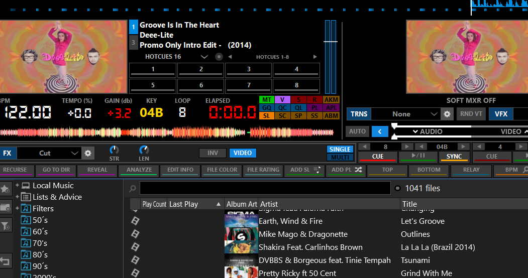
blink elapsed time on start 

Posted Tue 03 Dec 19 @ 10:35 pm
This has been fixed already for next update (most likely next week )
Posted Wed 04 Dec 19 @ 9:05 am
First, Thanks for this wonderful interface!!
I have a question, Is it possible to remove or disable individual buttons on the row of default buttons? The Randomize button has a been a problem for me as it is so close to the AutoMix Options button in the Auto Mix panel, and also very close to the Play button for Preview. I have twice accidentally clicked Randomize and completely messed up my Auto Mix.
I would love to be able to either remove the Randomize button or to disable it. If this is something that can not be done as a feature, then I am capable to fix it in the code if you point me in the right direction.
Please let me know.
Thank you again for this great interface.
Posted Mon 30 Dec 19 @ 5:01 pm
Thank's PhantomDeejay for this great interface!
One request though: an indicator for the sandbox mode (on/off)
One request though: an indicator for the sandbox mode (on/off)
Posted Sun 05 Jan 20 @ 1:36 pm
PhantomDeejay, thanks for a very smart and versatile skin that's loaded with many exciting variations. I enjoy the Vectro Classic view the best. I'm wondering if you could provide an inverted view to choose from in the Waveform Display in the near future? Thanks!
Posted Fri 10 Jan 20 @ 11:31 pm
PhantomDeejay wrote :
This has been fixed already for next update (most likely next week )
The upgrade has taken a bit longer than expected but I know it will be worth it, any idea when it will be done?...best regard.!!!
Posted Tue 18 Feb 20 @ 2:42 am
Hello,
the performance screen has a defect since the first version of the Vectro, the colors of the HotCue are flashing and only the other screen options happen on this screen, this does not happen, I use Mac Pro I7 with 2G video and Skin, Virtual Program and OS Catalina updated . I'm in Brazil and I'm using a translator, sorry for any typos.
the performance screen has a defect since the first version of the Vectro, the colors of the HotCue are flashing and only the other screen options happen on this screen, this does not happen, I use Mac Pro I7 with 2G video and Skin, Virtual Program and OS Catalina updated . I'm in Brazil and I'm using a translator, sorry for any typos.
Posted Thu 16 Apr 20 @ 2:29 pm
Hi DJPhantom
Thanks for the great NEW skin*****
I'm working many years very good with your famous skin bevor: SILVER SLEEK 3. The BIG Feature, I'm using extremly is your lines with many CUSTOMER BUTTONS.
Now, I want change to your New Skin VECTRO but there I can't synchronisation with my old systematics .
New Vectro have in the lower line many manufactures fixed aktions, but I don't use these for my action systematic.
How I can map ALL my old/own individual Customer Buttons to the new Vectro lines in the same places I know it.
That's a feature, that is singulary of all other skins!
Posted Sun 03 May 20 @ 4:47 pm
Hi George I hope you are well,
I too have been using silver sleek since Fruit got a real-life and have enjoyed your awesome Vectro skin since you released it.
Thank you for sharing your hard work with us.
As the previous post mentions, I too find the extra user buttons fantastic and would love to add another row(I work with a 27" screen) along with a small modification if possible; I would like to incorporate a similar feature as in the Orangejuice skin from Alex. I can't find it again but I know I saw it once, its a button or switch that drops a panel down with sampler and fx info from under the decks.
I'm sorry I can't explain it better right now, but the question is if you would even consider it?
Best Regards
Ray
Posted Mon 04 May 20 @ 11:42 am
There is a line of custom buttons on Vectro as well.
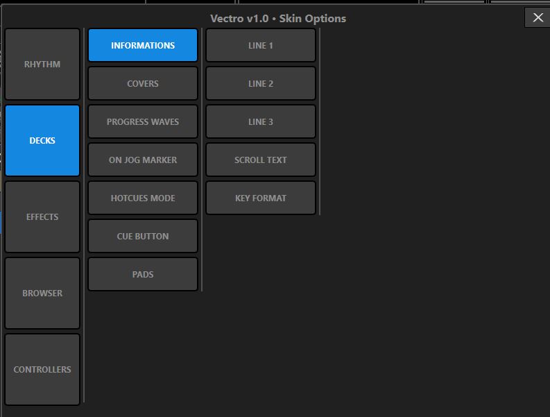
In order to access it, click on SKIN OPTIONS button (the one that looks like a monitor with a cog, right on the left side of layout select drop menu)
Then Press BROWSER button ->CUSTOM BUTTONS BAR -> ON
Finally click the X button on skin options window to close it
In order to access it, click on SKIN OPTIONS button (the one that looks like a monitor with a cog, right on the left side of layout select drop menu)
Then Press BROWSER button ->CUSTOM BUTTONS BAR -> ON
Finally click the X button on skin options window to close it
Posted Wed 06 May 20 @ 9:49 pm
Thanks PhantomDeejay for update 1.1. Great SandBox mode with progress indicator!
Posted Thu 07 May 20 @ 1:23 pm
Thank you very much for your answer to the "Customer-Buttons".
Your verynice Skin Silversleek3 has 2 rows of 23 buttons each, 10 of which are preassigned - so they cannot be changed.
The remaining 36! are occupied individually and several times, because you can create a list.
In VECTRO there are ONLY 23 fields for me to individualize, i.e. there are 13 ! Buttons LESS .
Maybe your workflow with the offered rows is enough for you, otherwise you would have designed differently, but once again I ask for the possibility to map ALL my previous button assignments to VECTOR.
This was and is an important reason for choosing your SilverSleek3.
I would very much like to switch to Vector.
Maybe there is a solution after all.
With best wishes
djfidelius
Posted Sun 10 May 20 @ 12:11 pm
Really liking the new skin! This will probably become my default go to skin! While playing around with it I saw where I can change from time elapsed to time remaining for the deck; but cannot seem to find it now to change it back. I would love to see both time elapsed and time remaining, is that possible or have an option to toggle by right clicking on whichever is showing now?
Thanks again for a very useful and nicely designed skin!
Thanks again for a very useful and nicely designed skin!
Posted Sun 24 May 20 @ 6:17 pm
OPT: DECKS: INFOS: FIELDS:
Hello PhantomDeeJay
your new Skin VEKTRO is nice, I like it - I have already written that.
My long-time favourite skin "SilverSleek 3", also created by you, now has 5 fields/rows to configure in the player's INFO window.
VECTRO offers 3 lines at most.
Some combinations on ONE line are possible / are offered.
But the fields: e.g. USER1 USER2 are no longer recorded! - are therefore also no longer representable.
Since I have now made informative entries in the TAG window provided by the VirtualDJ program, it would be a 'blackout' to switch to VECTRO.
And alternatively to rewrite tens of thousands of entries is hardly to be expected.
What could be a sensible solution to catch VECTRO as MY NEW FAVORITES after all?
With best wishes
DJF*
Posted Mon 25 May 20 @ 11:27 am
djfidelius wrote :
OPT: DECKS: INFOS: FIELDS:
Thanks, but I do not see that under options.

Posted Mon 25 May 20 @ 11:56 am
djfidelius wrote :
My long-time favourite skin "SilverSleek 3", also created by you, now has 5 fields/rows to configure in the player's INFO window.
VECTRO offers 3 lines at most.
Some combinations on ONE line are possible / are offered.
But the fields: e.g. USER1 USER2 are no longer recorded! - are therefore also no longer representable.
With best wishes
DJF*
Ok, I will add more options to include User1 and User2 fields.
However I won't add more info lines. They will remain 3 lines visible
Posted Tue 26 May 20 @ 7:09 pm
RCBAudio wrote :
Really liking the new skin! This will probably become my default go to skin! While playing around with it I saw where I can change from time elapsed to time remaining for the deck; but cannot seem to find it now to change it back. I would love to see both time elapsed and time remaining, is that possible or have an option to toggle by right clicking on whichever is showing now?
Thanks again for a very useful and nicely designed skin!
Thanks again for a very useful and nicely designed skin!
Clicking on "ELAPSED", "REMAIN" or "TOTAL" capture on screen should toggle the time on all layouts that have "single" time read-out (Controller, Controller+Video, & Classic)
For now I don't plan adding "dual" time display on these layouts
The rest layouts offer "dual" time:
2 Decks Slim
4 Decks Slim
DVS 2 Decks
DVS 4 Decks
2 Decks Stack
4 Decks Stack
Old School
Performance
Posted Tue 26 May 20 @ 7:18 pm
PhantomDeejay wrote :
Ok, I will add more options to include User1 and User2 fields.
However I won't add more info lines. They will remain 3 lines visible
djfidelius wrote :
My long-time favourite skin "SilverSleek 3", also created by you, now has 5 fields/rows to configure in the player's INFO window.
VECTRO offers 3 lines at most.
Some combinations on ONE line are possible / are offered.
But the fields: e.g. USER1 USER2 are no longer recorded! - are therefore also no longer representable.
With best wishes
DJF*
My long-time favourite skin "SilverSleek 3", also created by you, now has 5 fields/rows to configure in the player's INFO window.
VECTRO offers 3 lines at most.
Some combinations on ONE line are possible / are offered.
But the fields: e.g. USER1 USER2 are no longer recorded! - are therefore also no longer representable.
With best wishes
DJF*
Ok, I will add more options to include User1 and User2 fields.
However I won't add more info lines. They will remain 3 lines visible
Hi, PhantomDeejay
thank you for writing to add the fields not yet entered.
Can stay with 3 lines in the player.
Best wishes & good luck
DJF*
Posted Tue 26 May 20 @ 10:14 pm
PhantomDeejay wrote :
Clicking on "ELAPSED", "REMAIN" or "TOTAL" capture on screen should toggle the time on all layouts that have "single" time read-out (Controller, Controller+Video, & Classic)
For now I don't plan adding "dual" time display on these layouts
The rest layouts offer "dual" time:
2 Decks Slim
4 Decks Slim
DVS 2 Decks
DVS 4 Decks
2 Decks Stack
4 Decks Stack
Old School
Performance
Thanks! Loving the skin!
Posted Wed 27 May 20 @ 12:21 pm
Hi PhantomDeejay
in the browser the letters BIG: Ä - Ö - Ü are displayed in the lines: A - O - U (as already in SilverSleek3), even if they are written "Ä - Ö - Ü" in the TEXT EDITOR.
Also affects the names of the FOLDERs in the directory tree.
In VDJ-Default it is to be read correctly: Ä - Ö - Ü .
Is this intended?
Posted Wed 27 May 20 @ 9:12 pm


